Is the business card essential?
The business card is still essential
Having a business card is an official part of the professional world. It is essential during a meeting with a client or a new meeting and allows your contact person to stay in touch with you. In the digital age, one may wonder if the business card is still indispensable in our professional life.
Why create a business card?
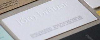
More than a simple piece of paper, the business card is an accessory that you cannot do without. It remains the best way to leave a good impression on your interlocutor. Beyond having a certain “style” when you give it to someone at a cocktail party, an evening or an event, the business card is not out of fashion! It will even allow you to avoid being drowned in the mass of contacts registered on your interlocutor’s phone.
Even if traditional, the business card allows you to give the essential information to your interlocutor in just a few lines. Practical to keep because of its wallet format, it remains accessible, and your contact can easily find it or at least stumble across it while tidying up his or her belongings. It is therefore the best way to avoid being forgotten!
An original business card also allows you to stand out and be remembered. Meeting new people is good, but when it leads to a collaboration or a contract, it is better!

The business card, a real institution in Japan
Especially useful in our professional life but not adopted by everyone, the business card is, unlike in our country, a must in Japan. Some people even have one from the beginning of their studies in order to build a network!
Called meishi, the Japanese business card respects a very strict format and is even the object of a quasi-ceremony when it is handed to a client. Indeed, in Japan, the business card is considered to be part of the person: it represents the person and is therefore owed as much respect.
This ceremony, called meishi koukan, takes place at the beginning of a meeting and aims to exchange the business cards of each person present. The main purpose is to avoid any mistakes in the hierarchy of positions or in the pronunciation of names.
Symbolically, the business card is a proof of meeting someone of a higher social rank. It is therefore highly inadvisable to neglect it, to the extent that it is necessary to carry a card holder so as not to put them in one’s wallet as they would then come into contact with money.
Mistakes to avoid
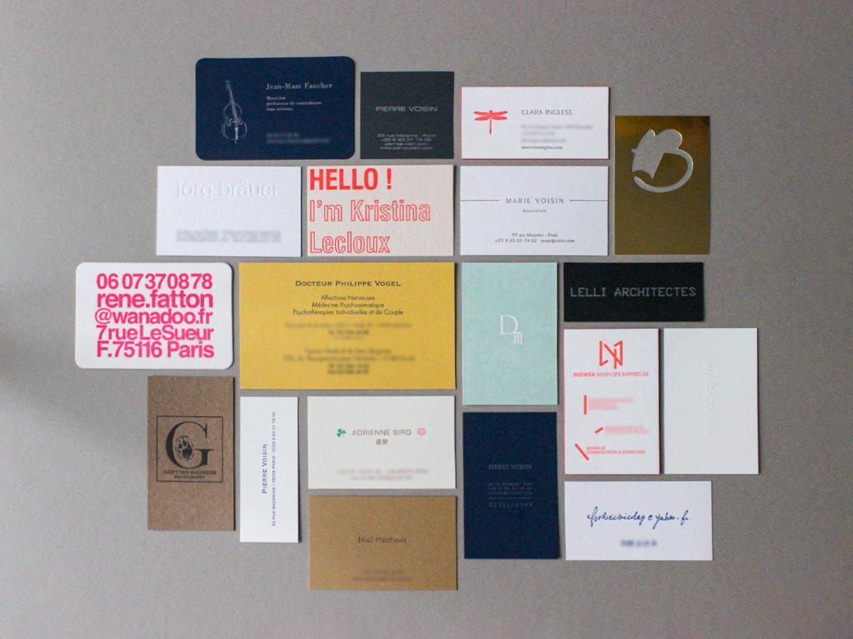
The aesthetics of the business card is crucial as it is the first impression people will have of you when they find your card by chance (or not!) in their wallet. There are several options available to you:
- You can opt for an original card… At your own risk! For instance, a business card with a format that is too original will not be practical to store and may not remain in a wallet for long.
- A business card inspired by the Japanese model, i.e., with only the necessary information: company name, position held, name of the person, contact details. This is simple and effective, but the card is extremely sober.
So do not go to extremes and keep it simple while still making an impression.
Our advice for an effective business card
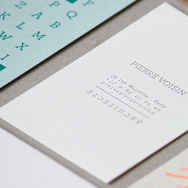
It may seem obvious, but make sure that all your essential information appears:
- Name and surname
- Company name and logo
- Telephone number and e-mail address
Other optional information:
- Position held
- Postal address
- Website
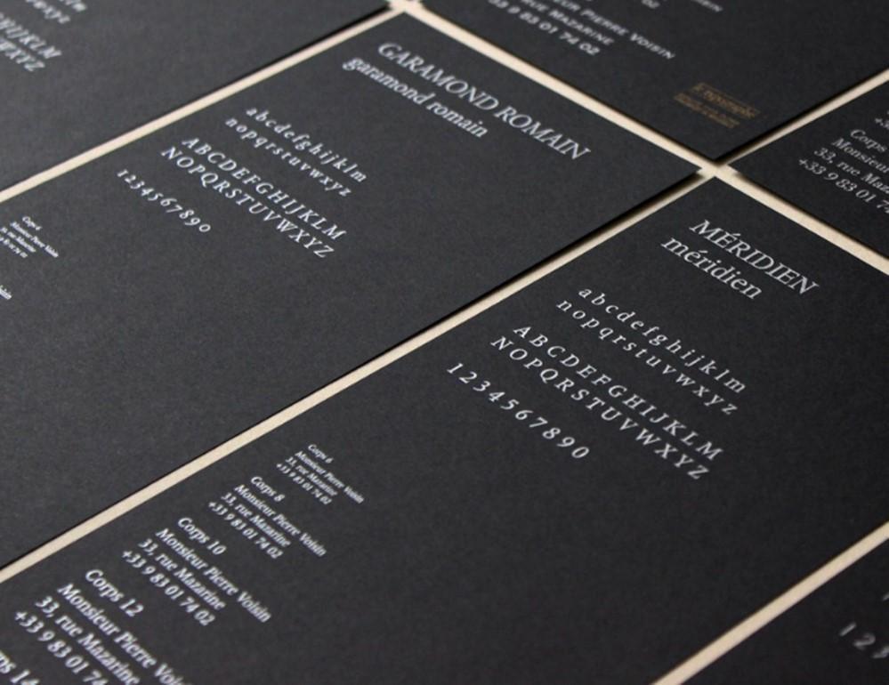
The typography
Do not hesitate to play with the typography in order to prioritise the information and highlight certain information more than others. Be careful, however, that the text remains readable and not too busy.
A “stick” or linear font will appear more modern, while an Old English or Anglaise font is more classic but still chic. If you prefer to play on a timeless sure thing, then Garamond is the typeface for you!
The format
The format can be personalised. Some prefer a longer card (4 x 8.5 cm for example), others a larger one. But be careful, ordinary card holders are made to accommodate a maximum size of 5.5 x 8.5 cm. One suggestion for standing out while remaining within the norm is to opt for rounded edges. This cutting is done by machine, so it is an additional work. If you wish to have an original cut, it is possible to make a cut shape adapted to your needs.
The business card can be use in landscape format or in portrait format. Depending on the information to be printed, you should choose what you think is most elegant.
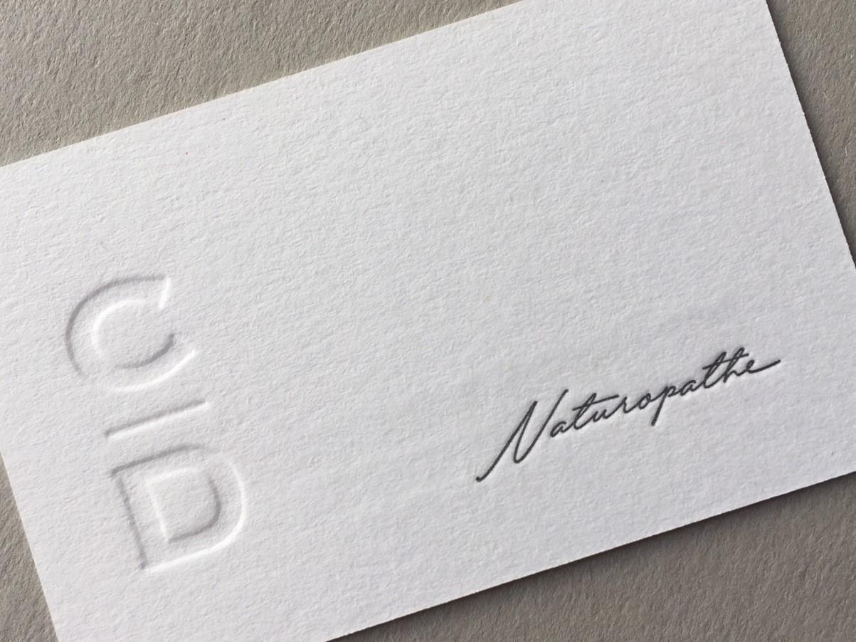
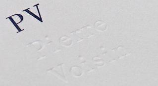
Embossing or letterpress?
For more originality, you can also opt for embossing or letterpress.
To achieve a deep-drawn print, also called letterpress, the pressure imposed in the machine will be greater than for a simple print. This means that the lead letters, by hitting the paper hard, will distort the paper. For a beautiful result, we recommend a heavy paper (360g) or even better, the 100% cotton paper that we offer in 600g.
The embossing is done with two moulds. The paper is deformed between the two parts of the mould. This way, on the front side, you will have a raised print of your text or logo and on the back side, you will see the corresponding hollow. For embossing, the entire range of 300g papers is ideal.
The weight of the paper will not allow you to achieve the same results. The papers offered by le typographe are carefully chosen for their quality, their colour, their texture. The papers we use are European, meeting the demanding European environmental standards.
The paper and print colors
The texture and colour of the paper are also important for an original and readable business card. On dark paper, choose a metallic printing colour (gold, silver, copper). On light colour paper, you can choose from the entire range of colours in a pantone (universal colour chart). The only colour to avoid in typography is white, which leaves a chalky, non-covering finish.
Finally, we advise you to use a maximum of one or two printing colours. Indeed, with each colour, your card will go through the machine, will have to dry, be checked… Each additional printing colour therefore multiplies the complexity of the card and the costs.
One last piece of advice: be sure to respect your company’s graphic charter to be easily recognizable. Using the colour(s) of your company logo as a source of inspiration is essential to remain identifiable. As you will have understood, an effective business card remains simple and readable but retains a touch of originality to enable you to stand out and make a mark! Sources : https://ameliemarieintokyo.com/meishi/ Photos le typographe . unsplash . istockphoto.com